ITV has a shiny new identity! Here’s what stands out to me.
A little chat about ITVs new identity, and what I think about their chosen approach.
If you’re short on time
- ITV has stripped back the noise and doubled down on a bold masterbrand, with Spark Yellow and a striking new design asset called the Apex leading the charge.
- The Apex isn’t just a shape, it’s a dynamic system built for motion, giving ITV the flexibility to flex across every platform while staying instantly recognisable.
- This refresh is more than a new look; it’s a statement about clarity, confidence and the future of brand identity in a fragmented digital world.
More than just a new look
When a brand as big as ITV updates its look, it is never just about visuals. It’s about how the whole system holds together, how it speaks to its audience and how it adapts across all the different places where we bump into it. From prime time telly to quick-fire social posts, ITV has to be instantly recognisable in seconds.
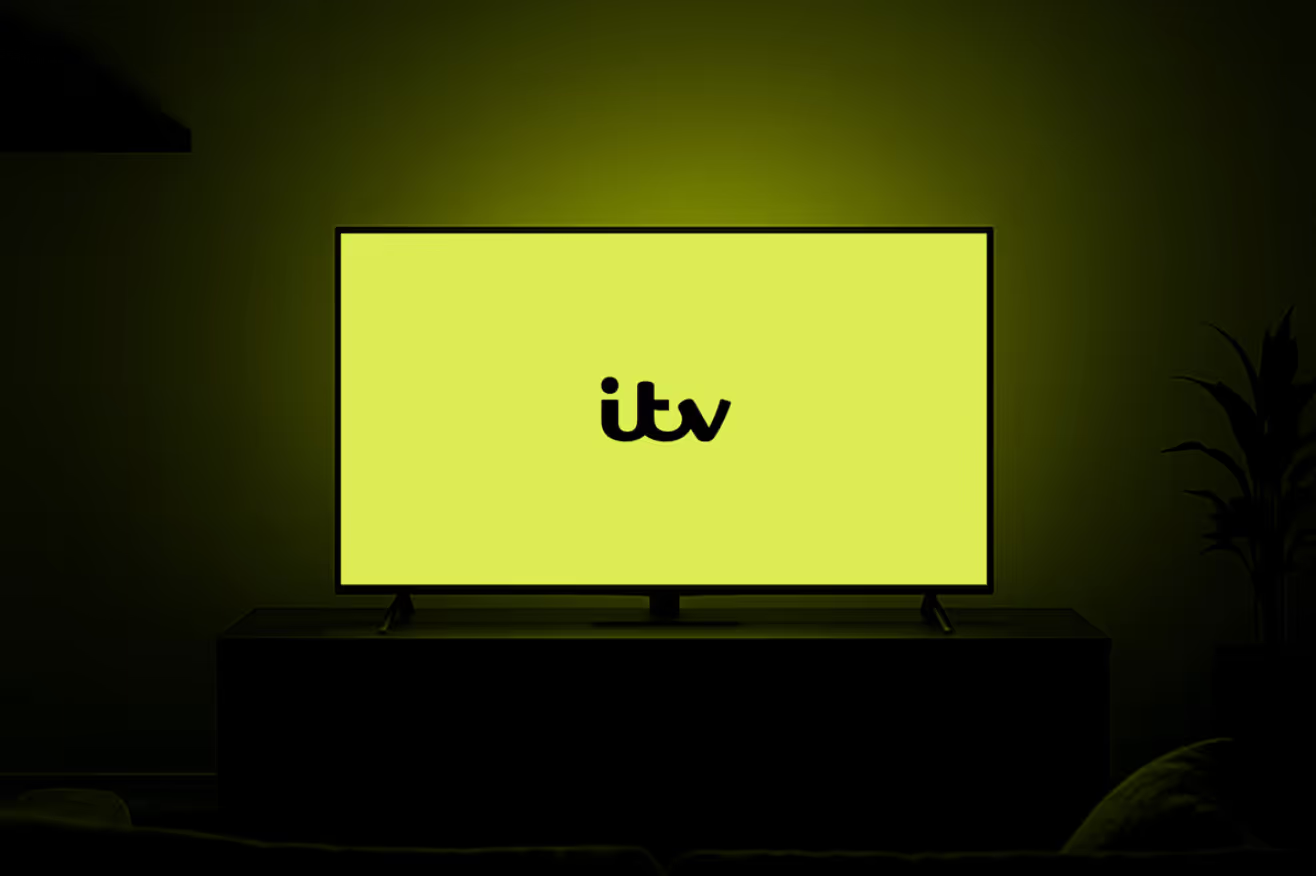
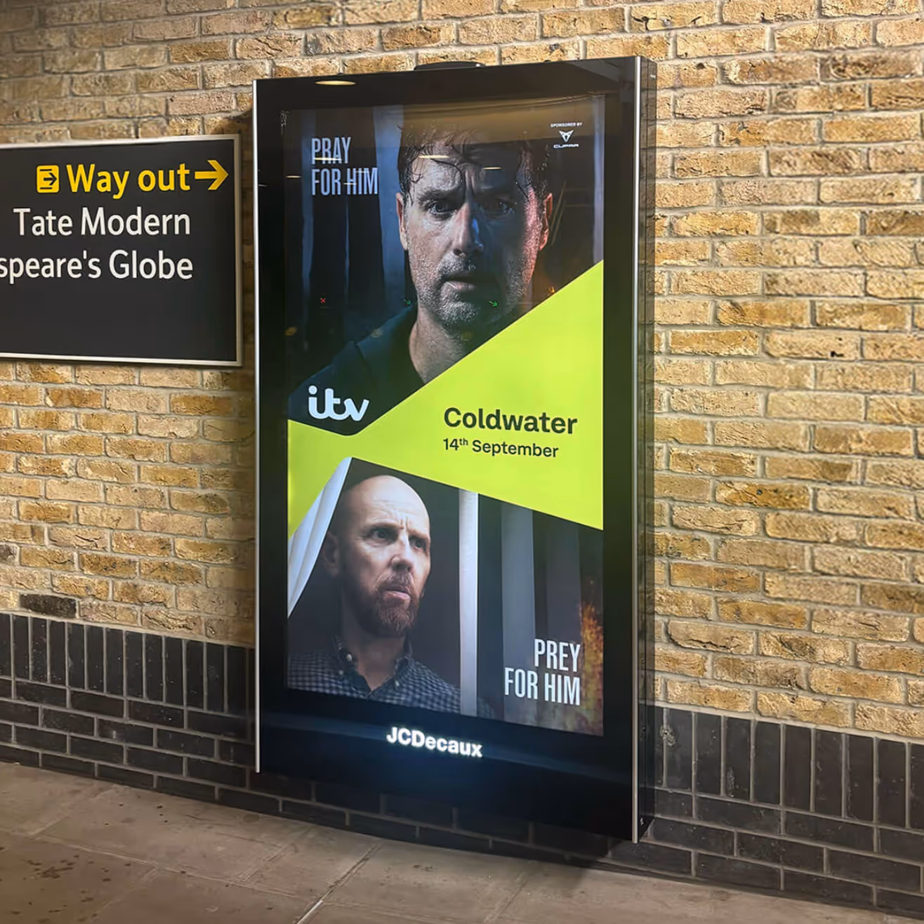
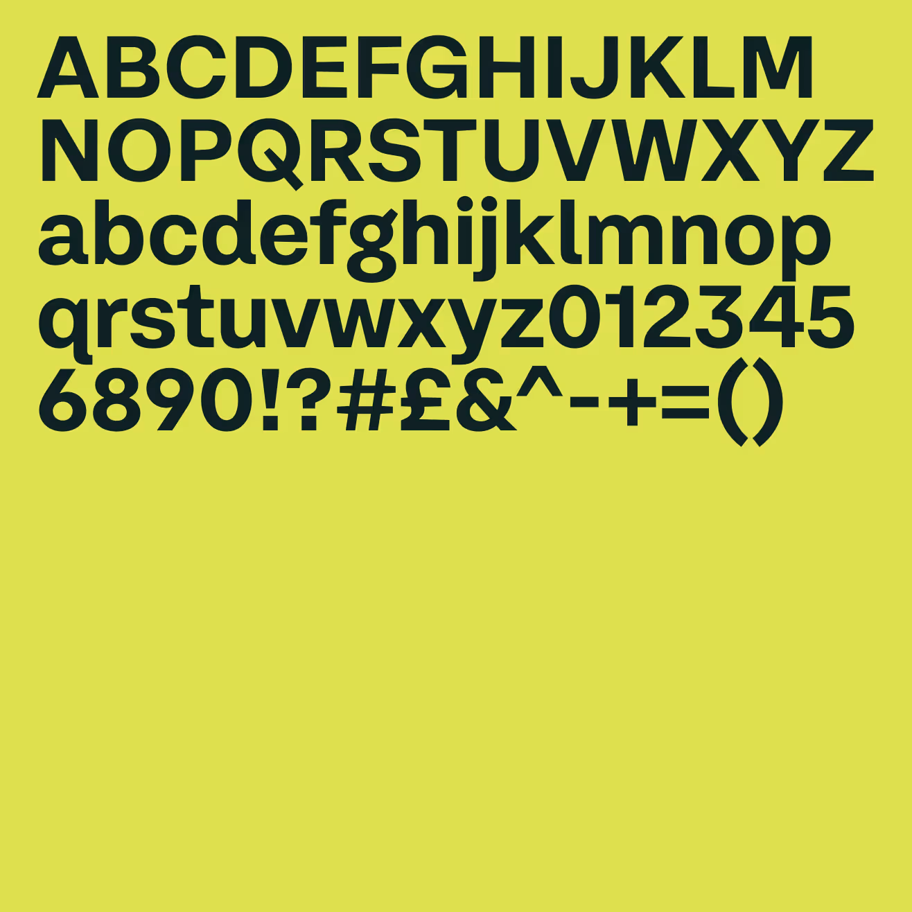
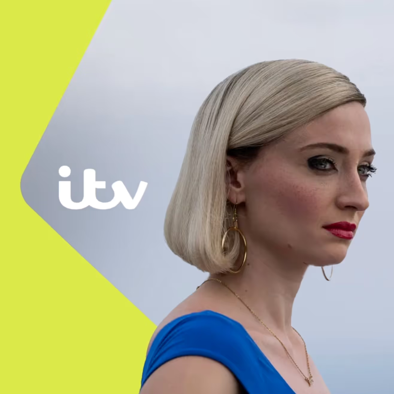
Their latest refresh, created with Studio Kiln, feels like a big moment. Since the launch of ITVX in 2022 the brand has been evolving, but this is the clearest expression yet of where they want to go. The focus is simplicity and confidence. Rather than relying on lots of separate identities, everything now connects back to a core ITV identity. Out with the clutter of sub-channel branding and rainbow of competing colours. In comes Spark Yellow as the hero shade and a new design asset called ✨ the Apex ✨.
The Apex and the power of motion
The Apex is clever. It takes inspiration from the X in ITVX and comes in more than fifty (!!!) variations. Motion is front and centre : the X can expand, orbit and drift around the ITV logo, creating movement while always returning to the centre. But why is motion positioned as so important? Here’s what I think : it means ITV can flex and adapt to different formats and moods without losing recognition. Whether you are watching a long-form trailer, spotting an ad on a billboard or catching a three-second clip in your feed, it still feels like ITV.
But what interests me most is the strategy behind it. By putting a core masterbrand at the centre, ITV is making a bold statement. The tone is more unified and more confident. It says : whatever you are watching, this is ITV. For an audience that is fragmented across endless platforms and devices, that clarity really matters.

Strategy, simplicity and what’s next
There is also the design systems perspective. This is not just a fresh coat of paint. Simplifying the toolkit means faster content creation, fewer clashing assets and less space for inconsistency to creep in. Internally, it is a much more practical system to run (woo!). Externally, it creates a sharper presence that can cut through in a crowded landscape.
I think this is ITV asking some big questions that many brands face right now. How do you keep things flexible without losing recognition? How do you balance richness with clarity? How do you adapt to new formats without looking scattered? Their answer is to simplify, strengthen the masterbrand and let a single visual asset and colour do the heavy lifting.
I find moves like this fascinating. They feel bold but also open up space for conversation. Will betting everything on the masterbrand be the right call long term? Does stripping back risk losing some of the playfulness ITV has had in the past, or does it make them sharper and stronger? It is a confident step, but it is also an experiment in how identity systems work in a new digital era. And that’s what makes it so exciting to watch!!